

Learn how to create pulse loader in css




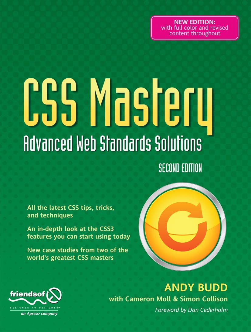
CSS Mastery: Advanced Web Standards Solutions
Provides information on developing Web sites using CSS3, covering such topics as the visual formatting, model, styling links, layout, and bugs and bug fixing.
A loading animation improves user experience by letting visitors know that content is being processed. One of the simplest yet most attractive loading animations is the CSS Pulse Loader. It creates expanding circular waves using pure CSS, without requiring JavaScript, images, or external libraries.
In this tutorial, you'll learn how to create a beautiful pulse loader using only HTML and CSS. We'll cover the HTML structure, CSS styling, animation, customization options, and best practices for using loaders in modern websites.
What is a Pulse Loader?
A Pulse Loader is a circular loading animation where one or more rings continuously expand outward while gradually fading away. It gives the appearance of a pulse or ripple, making it perfect for loading screens, API requests, and waiting states.
Since it uses only CSS animations, it is lightweight, responsive, and works across all modern browsers.
HTML Structure
The HTML required for this loader is very simple. We create a parent container with two
empty <div> elements. Each circle is animated separately to create a
continuous pulse effect.
<div class="pulse-loader">
    <div></div>
    <div></div>
</div>
The first circle starts immediately, while the second circle begins slightly later, creating a smooth looping animation.
CSS Code
Now let's style the loader and create the pulse animation using CSS keyframes.
.pulse-loader{
    position: relative;
    width: 80px;
    height: 80px;
}

.pulse-loader div{
    position: absolute;
    border: 4px solid #fdba03;
    border-radius: 50%;
    animation: pulse-loader 1s ease-out infinite;
}

.pulse-loader div:nth-child(2){
    animation-delay: -0.5s;
}

@keyframes pulse-loader{

    0%{
        top: 40px;
        left: 40px;
        width: 0;
        height: 0;
        opacity: 1;
    }

    100%{
        top: 0;
        left: 0;
        width: 80px;
        height: 80px;
        opacity: 0;
    }
}
Tip: The second circle uses
animation-delay: -0.5s; so it starts halfway through the animation.
This creates an uninterrupted pulse effect instead of waiting for the first animation
to finish.
Understanding the CSS
1. Container
The parent container defines the total size of the loader. Both animated circles are positioned relative to this container.
.pulse-loader{
    position: relative;
    width: 80px;
    height: 80px;
}
2. Circle Styling
Each child div becomes a perfect circle using
border-radius: 50%. Instead of filling the circle, only the border is drawn,
creating a ripple-like effect.
.pulse-loader div{
    position: absolute;
    border: 4px solid #fdba03;
    border-radius: 50%;
}
3. Animation
The @keyframes animation gradually increases the circle's width and height
while reducing its opacity from 1 to 0.
@keyframes pulse-loader{

    0%{
        width: 0;
        height: 0;
        opacity: 1;
    }

    100%{
        width: 80px;
        height: 80px;
        opacity: 0;
    }
}
This combination creates the expanding ripple effect that continuously repeats.
How the Animation Works
- The animation starts with a tiny invisible circle.
- The circle expands smoothly.
- Its opacity decreases while growing.
- When it disappears completely, the animation starts again.
- The second circle begins halfway through, creating a continuous pulse.
Customizing the Loader
You can easily customize the loader according to your project requirements.
Change Color
border: 4px solid #3b82f6;Increase Size
.pulse-loader{
    width:120px;
    height:120px;
}
Slow Down Animation
animation: pulse-loader 2s ease-out infinite;Make it Faster
animation: pulse-loader .7s ease-out infinite;Complete Working Example
<!DOCTYPE html>
<html>
<head>
<style>

/* CSS Here */

</style>
</head>

<body>

<div class="pulse-loader">
    <div></div>
    <div></div>
</div>

</body>
</html>
Common Mistakes
1. Using the Wrong Child Selector
If your HTML contains only two child elements, use
:nth-child(2) instead of :nth-child(12).
Otherwise, the animation delay will never be applied.
/* ❌ Wrong */
.pulse-loader div:nth-child(12){}

/* ✅ Correct */
.pulse-loader div:nth-child(2){}
2. Forgetting position: relative
Without a relative parent container, the circles won't expand from the correct position.
3. Removing Overflow Space
Make sure the parent container has enough width and height so the expanding circles aren't clipped.
Where Can You Use a Pulse Loader?
- API requests
- File uploads
- Page loading screens
- AJAX calls
- Waiting for database responses
- Dashboard loading indicators
- Mobile web applications
Browser Support
CSS animations and keyframes are supported in all modern browsers including Chrome, Firefox, Safari, Edge, and Opera. No external libraries or dependencies are required.
Quick Reference
HTML
<div class="pulse-loader">
    <div></div>
    <div></div>
</div>

CSS
position: relative;
border-radius: 50%;
animation: pulse-loader 1s ease-out infinite;

Animation
Expand → Fade Out → Repeat
Conclusion
A CSS Pulse Loader is a lightweight and elegant loading animation that can be created using only a few lines of HTML and CSS. It requires no JavaScript, images, or third-party libraries, making it fast and easy to integrate into any website or web application.
By understanding CSS keyframes, animation delays, and positioning, you can easily modify the loader's size, color, speed, and style to match your project's design.
Whether you're building a personal portfolio, dashboard, SaaS application, or e-commerce website, this pulse loader provides a clean and professional loading experience for your users.
CSS Mastery: Advanced Web Standards Solutions
Provides information on developing Web sites using CSS3, covering such topics as the visual formatting, model, styling links, layout, and bugs and bug fixing.
📚 You Might Also Like
- → Best Google AdSense Alternative 2026 - Monetag Review for Publishers miscellaneous
- → Top Java Interview Questions for 6+ Years Experience (2026) java
- → HTTP QUERY Method (RFC 10008) — The New HTTP Method Every Developer Should Know miscellaneous
- → How to Start Freelancing as a Web Developer in 2026 (Complete Beginner's Guide) miscellaneous
- → MyLync - Best Free Linktree Alternative for Developers, Creators & Businesses miscellaneous