

Multiple Border Design Using CSS - 5 Methods with Live Examples




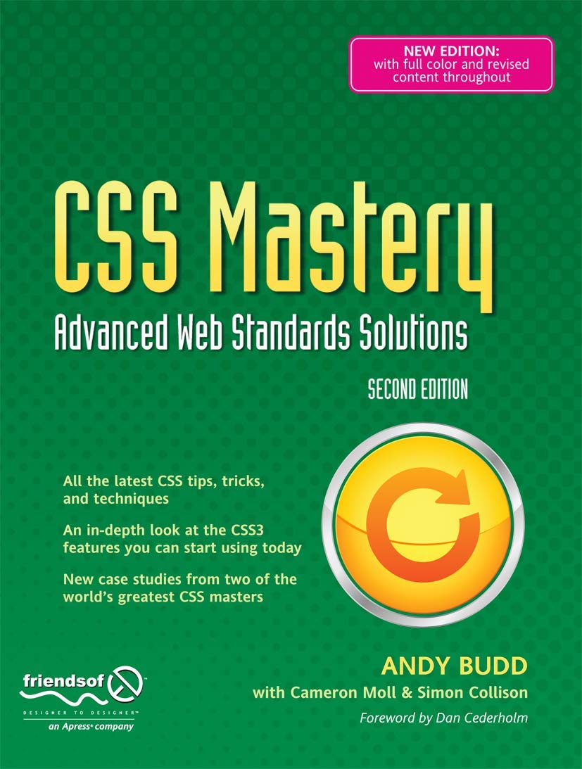
CSS Mastery: Advanced Web Standards Solutions
Provides information on developing Web sites using CSS3, covering such topics as the visual formatting, model, styling links, layout, and bugs and bug fixing.
CSS borders are one of those things most developers use every day without thinking twice — a solid line around a div, maybe a rounded corner here and there. But there is a whole world of creative border effects hiding inside CSS that most tutorials never cover.
In this guide we will explore multiple ways to create multiple borders, animated hover effects, glowing outlines, and layered ring effects using pure CSS — no images, no JavaScript, no libraries. Just CSS doing what it does best.
Why Multiple Borders?
HTML elements only have one border property — you cannot
natively add two or three borders to a single element. But CSS gives
us several workarounds that are even more powerful than a plain border:
- box-shadow — the most versatile technique. Supports multiple shadows stacked on top of each other, each acting as a separate border ring.
- outline — a second border-like ring drawn outside the element's normal border, with its own offset control.
- border + outline + box-shadow — combining all three gives you up to three distinct border layers on one element.
- Pseudo-elements (::before, ::after) — create completely separate decorative layers around any element.
Method 1 — Multiple Borders Using box-shadow
The box-shadow property is the most powerful tool for
creating multiple border effects. By using the spread radius parameter
(the fourth value) and setting the blur to zero, you can make
box-shadows behave exactly like solid borders — and stack as many as
you want.
The syntax for a solid border-like shadow is:
box-shadow: 0 0 0 [thickness]px [color];And for multiple borders — just comma-separate them:
box-shadow:
  0 0 0 10px #color1,   /* first ring  — 10px thick */
  0 0 0 20px #color2,   /* second ring — 10px thick (starts at 10px) */
  0 0 0 30px #color3;   /* third ring  — 10px thick (starts at 20px) */
Basic Multiple Border Example
.multi-border {
  width: 100px;
  height: 100px;
  background-color: #3b82f6;
  border-radius: 50%;
  box-shadow:
    0 0 0 10px #60a5fa,
    0 0 0 20px #93c5fd,
    0 0 0 30px #bfdbfe;
}
Live Demo — Hover Effects With Multiple Borders
Here is the exact effect from the original post — a circular icon that reveals layered border rings on hover — rebuilt cleanly with full explanation. Hover over the icons below to see the effect:
Hover me
Hover me
Hover me
Hover me
CSS Code for the Demos Above
/* Base state — single subtle ring */
.icon-circle {
  display: inline-flex;
  align-items: center;
  justify-content: center;
  width: 80px;
  height: 80px;
  border-radius: 100%;
  box-shadow: 0 0 0 10px #615d82;
  font-size: 36px;
  transition: all 0.6s ease;
  cursor: pointer;
  color: #fff;
}

/* Hover state — four layered border rings appear */
.icon-circle:hover {
  box-shadow:
    0 0 0 10px #522d1b,
    0 0 0 20px #926d39,
    0 0 0 30px #d3b397,
    0 0 0 40px #ece4d8;
  background-color: #d3b397;
  color: #ece4d8;
  transform: scale(1.05);
}
Method 2 — Multiple Borders Using border + outline
CSS gives you two separate border-like properties on every element —
border and outline. Combined with
outline-offset you get two distinct border rings with
gap control between them:
.double-border {
  width: 150px;
  height: 150px;
  background: #1e40af;
  border: 4px solid #60a5fa;         /* inner border */
  outline: 4px solid #bfdbfe;        /* outer border */
  outline-offset: 6px;               /* gap between border and outline */
  border-radius: 12px;
}Method 3 — Glowing Border Effect
By adding a blur value (the third parameter) to box-shadow, you get a glowing effect instead of a hard border ring. Combine this with a solid ring for a beautiful neon glow look:
.glow-border {
  width: 150px;
  height: 150px;
  background: #0f172a;
  border-radius: 12px;
  box-shadow:
    0 0 0 2px #3b82f6,           /* solid inner ring */
    0 0 15px 4px #3b82f6,        /* blue glow */
    0 0 30px 8px rgba(59,130,246,0.3); /* wider soft glow */
  transition: box-shadow 0.4s ease;
}

.glow-border:hover {
  box-shadow:
    0 0 0 2px #60a5fa,
    0 0 20px 8px #3b82f6,
    0 0 40px 16px rgba(59,130,246,0.4);
}Method 4 — Animated Pulsing Border
Add CSS keyframe animations to make your border rings pulse outward — a great effect for call-to-action buttons or featured items:
@keyframes pulse-rings {
  0% {
    box-shadow:
      0 0 0 0 rgba(59, 130, 246, 0.8),
      0 0 0 0 rgba(59, 130, 246, 0.4);
  }
  70% {
    box-shadow:
      0 0 0 15px rgba(59, 130, 246, 0),
      0 0 0 30px rgba(59, 130, 246, 0);
  }
  100% {
    box-shadow:
      0 0 0 0 rgba(59, 130, 246, 0),
      0 0 0 0 rgba(59, 130, 246, 0);
  }
}

.pulse-button {
  width: 60px;
  height: 60px;
  border-radius: 50%;
  background: #3b82f6;
  border: none;
  cursor: pointer;
  animation: pulse-rings 2s infinite;
}Method 5 — Multiple Borders on Text
The same box-shadow technique works on text too using
text-shadow stacked multiple times — or on a text
container div for a boxed effect:
/* Multiple text shadows for a layered text border effect */
.multi-shadow-text {
  font-size: 48px;
  font-weight: 900;
  color: #fff;
  text-shadow:
    2px 2px 0 #3b82f6,
    4px 4px 0 #1d4ed8,
    6px 6px 0 #1e3a8a;
}

/* Box with multiple rings around text */
.text-with-rings {
  display: inline-block;
  padding: 16px 32px;
  color: #fff;
  font-weight: 700;
  font-size: 20px;
  border-radius: 8px;
  background: #1e40af;
  box-shadow:
    0 0 0 4px #3b82f6,
    0 0 0 8px #93c5fd,
    0 0 0 12px rgba(147, 197, 253, 0.3);
}
box-shadow Parameters Explained
Understanding what each value in box-shadow does will help you create exactly the effect you want:
box-shadow: [x-offset] [y-offset] [blur-radius] [spread-radius] [color];

/* For a solid border ring — set x, y, and blur all to 0 */
box-shadow: 0 0 0 10px #3b82f6;
/*          ^x ^y ^blur ^spread ^color  */

/* For a drop shadow — add x/y offset and blur */
box-shadow: 4px 4px 10px 0 rgba(0,0,0,0.5);

/* For a glow — set x/y to 0, add blur, use semi-transparent color */
box-shadow: 0 0 20px 5px rgba(59, 130, 246, 0.6);| Parameter | What It Does | For solid ring use |
|---|---|---|
| x-offset | Horizontal position | 0 |
| y-offset | Vertical position | 0 |
| blur-radius | How blurry/soft the shadow is | 0 (sharp edge) |
| spread-radius | How thick the ring is | 10px (your ring thickness) |
| color | Color of the ring | Any CSS color |
Where to Use These Effects
- About Us / Services sections — circular icons with hover ring effects look professional and modern on feature grids.
- Pricing cards — use a glowing ring to highlight the recommended plan and draw the user's eye.
- Profile avatars — layered rings around profile pictures add a polished premium feel.
- Call-to-action buttons — pulsing ring animations draw attention to the most important button on a page.
- Live / Online indicators — a small pulsing green circle is the universal signal for "live" or "online now."
- Card hover effects — a subtle ring appearing on card hover gives satisfying visual feedback without being distracting.
Common Mistakes to Avoid
1. Forgetting box-shadow does not affect layout
Unlike border, box-shadow does not take up
space in the document flow. It draws outside the element but does not
push surrounding elements away. If your rings are getting clipped or
overlapping nearby elements, add margin to compensate:
/* If rings are 40px total, add margin to make room */
.icon-circle {
  box-shadow: 0 0 0 40px rgba(255,255,255,0.1); /* outermost ring */
  margin: 45px; /* add margin so rings don't overlap neighbours */
}
2. Too many rings with too little spacing
/* ❌ Bad — rings overlap each other, looks muddy */
box-shadow:
  0 0 0 5px #color1,
  0 0 0 6px #color2,
  0 0 0 7px #color3;

/* ✅ Good — each ring has clear thickness */
box-shadow:
  0 0 0 8px  #color1,
  0 0 0 16px #color2,
  0 0 0 24px #color3;
3. Forgetting transition on hover effects
/* ❌ Rings appear instantly — jarring */
.icon:hover {
  box-shadow: 0 0 0 10px #blue, 0 0 0 20px #lightblue;
}

/* ✅ Smooth transition */
.icon {
  transition: box-shadow 0.5s ease, background-color 0.5s ease;
}
.icon:hover {
  box-shadow: 0 0 0 10px #blue, 0 0 0 20px #lightblue;
}
Final Thought
Multiple border effects using CSS box-shadow are one of
those techniques that look impressive but take only a few lines of code
to implement. The key insight is that box-shadow with zero
x, y, and blur behaves exactly like a solid border — and stacking
multiple shadows with increasing spread values creates perfectly spaced
concentric rings.
Start with the hover ring effect for icon sections on your site — it is the most universally applicable and makes any feature grid look dramatically more polished. Then experiment with glow effects and pulsing animations for call-to-action elements.
Have a specific border design idea in mind? Drop us a message on our contact page and we will help you bring it to life with CSS.
CSS Mastery: Advanced Web Standards Solutions
Provides information on developing Web sites using CSS3, covering such topics as the visual formatting, model, styling links, layout, and bugs and bug fixing.
📚 You Might Also Like
- → Best Google AdSense Alternative 2026 - Monetag Review for Publishers miscellaneous
- → Top Java Interview Questions for 6+ Years Experience (2026) java
- → HTTP QUERY Method (RFC 10008) — The New HTTP Method Every Developer Should Know miscellaneous
- → How to Start Freelancing as a Web Developer in 2026 (Complete Beginner's Guide) miscellaneous
- → MyLync - Best Free Linktree Alternative for Developers, Creators & Businesses miscellaneous