
Instagram New Wordmark 2026: Font, Design Changes & Trend Explained



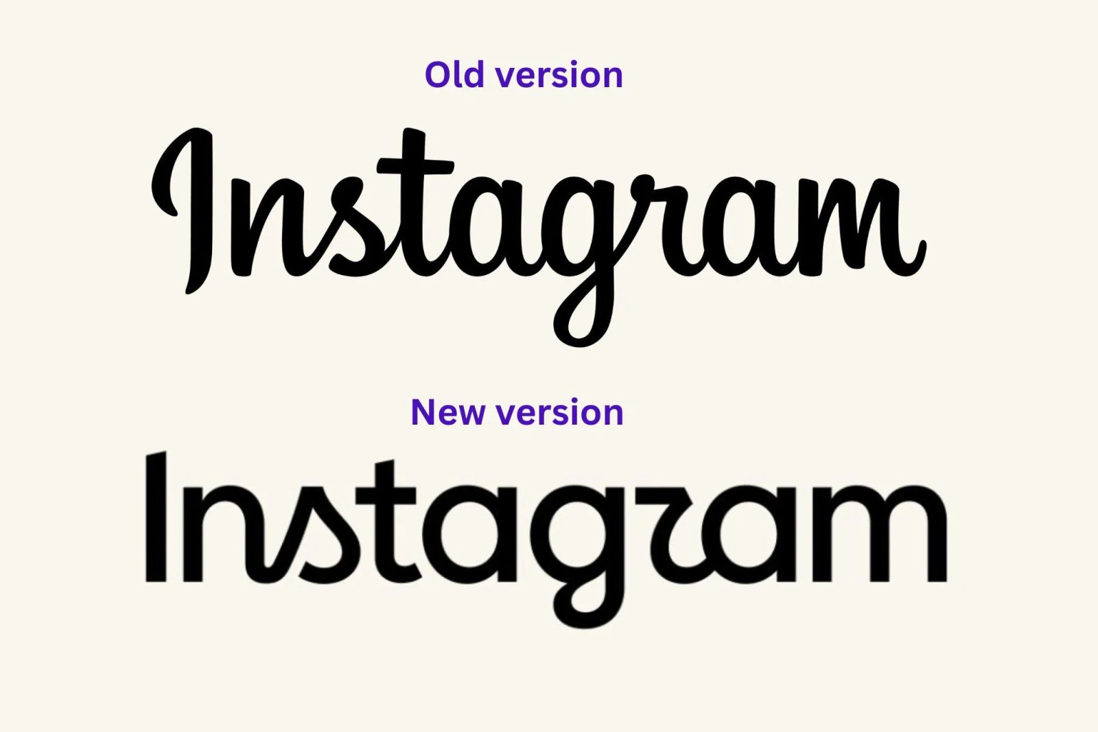
If you have recently opened Instagram and felt that something about the logo text looks different, you are not alone. The Instagram wordmark has been catching attention with its more expressive, handwritten appearance, especially the distinctive shapes of letters such as s and g. Small typography changes can dramatically change how a brand feels, and Instagram's updated wordmark is a great example of that.
In this article, we take a closer look at the Instagram wordmark in 2026, what appears to have changed, the typography behind its distinctive style, whether you can download the exact Instagram font, and how you can recreate a similar handwritten wordmark effect for your own projects.
What Is the Instagram Wordmark?
A wordmark is a logo made primarily from a brand's name using custom typography. Instead of relying only on an icon or symbol, the lettering itself becomes an important part of the brand identity.
The Instagram wordmark is instantly recognizable because it does not look like ordinary text typed with a standard system font. Its letters have a custom, handwritten personality with smooth curves, connected strokes, and unique shapes that give the brand a more human and expressive appearance.
What Changed in Instagram's New Wordmark?
The change is subtle enough that many users may not immediately notice it. However, when you compare the lettering closely, the updated wordmark feels more stylized and expressive. The character shapes, curves, spacing, and handwritten details contribute to a different overall visual impression.
One of the reasons the new wordmark has become a trend is that people are paying close attention to individual letters. Some characters have distinctive curves and shapes that are difficult to reproduce using a normal font alone. This is especially noticeable when people try to recreate the style using their own names, usernames, or brand names.
A Closer Look at the Lettering
What makes the Instagram-style wordmark interesting is that the letters do not feel completely uniform. A traditional font follows a consistent set of typographic rules, but a custom wordmark can treat individual characters as part of an illustration.
- Rounded strokes give the lettering a soft and friendly appearance.
- Handwritten curves make the wordmark feel less mechanical than a standard sans-serif font.
- Unique letter shapes help individual characters become recognizable parts of the brand.
- Custom spacing and proportions give the entire wordmark its distinctive rhythm.
Is the Instagram Wordmark a Regular Font?
Not exactly. One of the biggest misconceptions is that the Instagram logo text can simply be recreated by installing a single font and typing a word. Brand wordmarks often contain custom modifications, adjusted characters, spacing, and hand-drawn details.
This is why a font may look similar at first but still fail to reproduce the exact appearance. A particularly distinctive letter can make the difference obvious when you compare a font-generated version with the actual wordmark.
Important: Similar fonts can help you recreate the general handwritten style, but they may not match the Instagram wordmark exactly. The official brand lettering contains distinctive design characteristics that make it more than just standard typed text.
Why Does the New Wordmark Feel Different?
Typography has a powerful effect on how people perceive a brand. Even when the name remains exactly the same, changing the curves, proportions, or personality of the letters can make a familiar logo feel completely new.
The more expressive style gives the wordmark a stronger personality. It feels creative, recognizable, and less generic than simply using a clean geometric font. For a visual platform like Instagram, that type of personality fits naturally with a brand built around creativity and self-expression.
Why Is the Instagram Wordmark Becoming a Trend?
As people started noticing the updated lettering, many began recreating the style using their own names and brands. Social media users, designers, and developers have experimented with transforming ordinary text into an Instagram-inspired wordmark.
The trend works because the result is immediately recognizable. You can take almost any name and apply a similar handwritten style to create something that feels familiar while still being personalized.
For example:
instagram → yourname
instagram → yourbrand
instagram → tipsandtricks.dev
Can You Recreate an Instagram-Inspired Wordmark?
Yes. While reproducing the exact official wordmark may require custom artwork and precise typography, you can recreate a similar handwritten effect using HTML, CSS, SVG, or graphic design tools.
For developers, one interesting approach is to treat the text as individual characters rather than one normal text element. This makes it possible to adjust specific letters independently.
<div class="wordmark">
    <span>t</span>
    <span>i</span>
    <span>p</span>
    <span class="special-letter">s</span>
</div>
Individual letters can then be styled with different transforms, spacing, rotation, or even custom SVG paths to create a more expressive result.
Using CSS to Create a Handwritten Wordmark Effect
CSS alone cannot always reproduce a custom brand wordmark perfectly, but it can help create a similar visual style. You can experiment with typography, letter spacing, rotation, and character-level transformations.
.wordmark {
    font-family: cursive;
    font-size: 64px;
    letter-spacing: -3px;
}

.wordmark .special-letter {
    display: inline-block;
    transform: rotate(-8deg) scale(1.08);
}
The key idea is not to apply the same styling to every letter. Custom wordmarks often look more natural because individual characters have their own shapes, angles, and proportions.
The Challenge of Matching Specific Letters
Some letters are easier to reproduce than others. A normal font may create a simple character, while the original wordmark uses a more decorative or custom-drawn version.
This is why simply searching for an "Instagram font" may not produce an exact match. If you are recreating the style for a design experiment, you may need to combine a similar base font with manual adjustments to specific letters.
Typography Is More Important Than It Looks
The Instagram wordmark trend is also a reminder that branding is not only about choosing a logo icon. Typography can become a major part of a company's visual identity.
Think about some of the world's most recognizable brands. In many cases, you can recognize the company simply by looking at the style of its lettering. The exact shape of a single letter, the curve of a stroke, or the spacing between characters can become part of what people remember.
Should You Use the Instagram Wordmark Style for Your Own Brand?
You can certainly use the trend as inspiration for creative experiments, social media graphics, and typography projects. However, building a strong brand usually means creating your own recognizable visual identity rather than copying another company's official logo exactly.
A better approach is to take inspiration from the qualities that make the style interesting: expressive lettering, custom character shapes, personality, and attention to detail. You can then create something unique for your own name or project.
Final Thoughts
The Instagram wordmark proves that even a subtle typography change can create a huge conversation. What looks like a small adjustment at first can become instantly noticeable once people start comparing letter shapes, curves, and spacing.
Whether you are a designer interested in typography, a developer experimenting with HTML and CSS, or simply someone trying to recreate the trend with your own name, the new Instagram-style wordmark is an interesting example of how custom lettering can give a familiar brand a completely different personality.
Try it yourself: Experiment with different fonts, adjust individual letters, change spacing and rotation, and see how small details can transform ordinary text into a unique wordmark.
📚 You Might Also Like
- → Best Google AdSense Alternative 2026 - Monetag Review for Publishers miscellaneous
- → Top Java Interview Questions for 6+ Years Experience (2026) java
- → How to Start Freelancing as a Web Developer in 2026 (Complete Beginner's Guide) miscellaneous
- → HTTP QUERY Method (RFC 10008) — The New HTTP Method Every Developer Should Know miscellaneous
- → MyLync - Best Free Linktree Alternative for Developers, Creators & Businesses miscellaneous